

Bold new packaging* for a protein powder brand.
Protinex is a nutritional protein supplement that has been prescribed in India for over 60 years. After being acquired by Danone India, the corporate identity and packaging was redesigned.
OVERVIEW
Protinex approached Ray+Keshavan | Superunion for a redesign of their branding and packaging to make them more relevant to the new health-aware Indian consumer. The product had also been given an overhaul with new flavours/benefits and a better taste. It was necessary to increase the emotional quotient of the pack as well as cue the brand’s scientific heritage.
The new packaging needed to convey premium-ness and have 'appetite appeal'. It needed to highlight the different offerings of the products and not just variations in flavours.
While considering aspects of the old packaging that were proven to be working – the boldness of the logotype, the upward slanting banner and scientific elements – this was my proposed redesign.
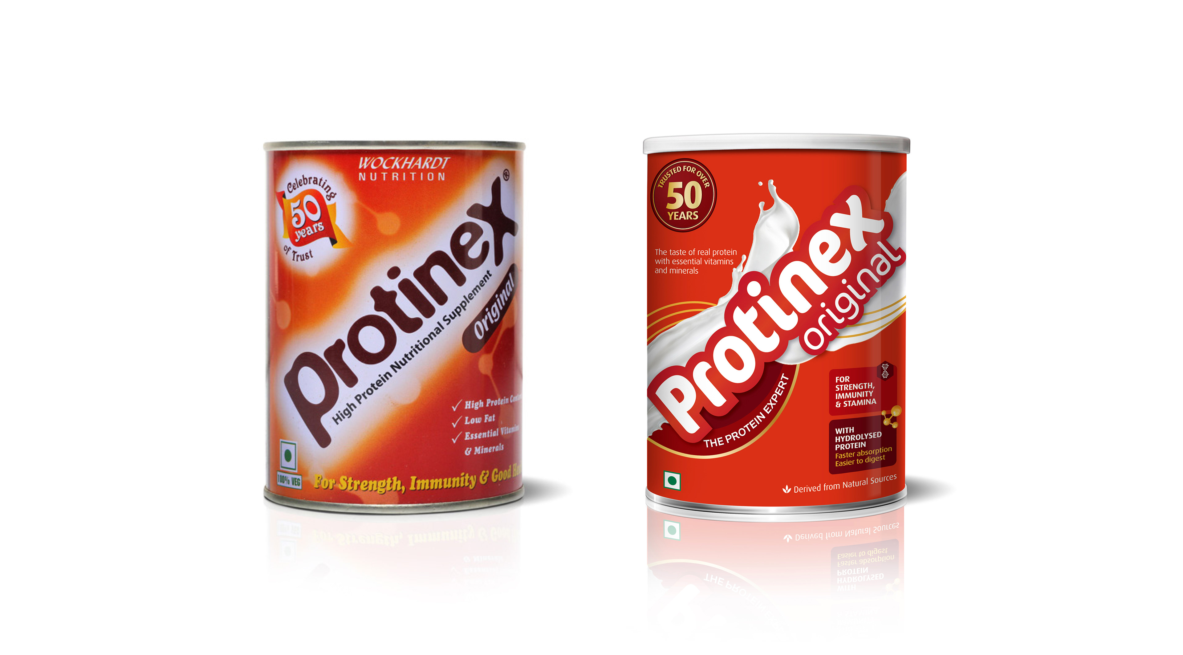
Left: Previous packaging for the Original variant
Right: Proposed redesign of packaging for the Original variant
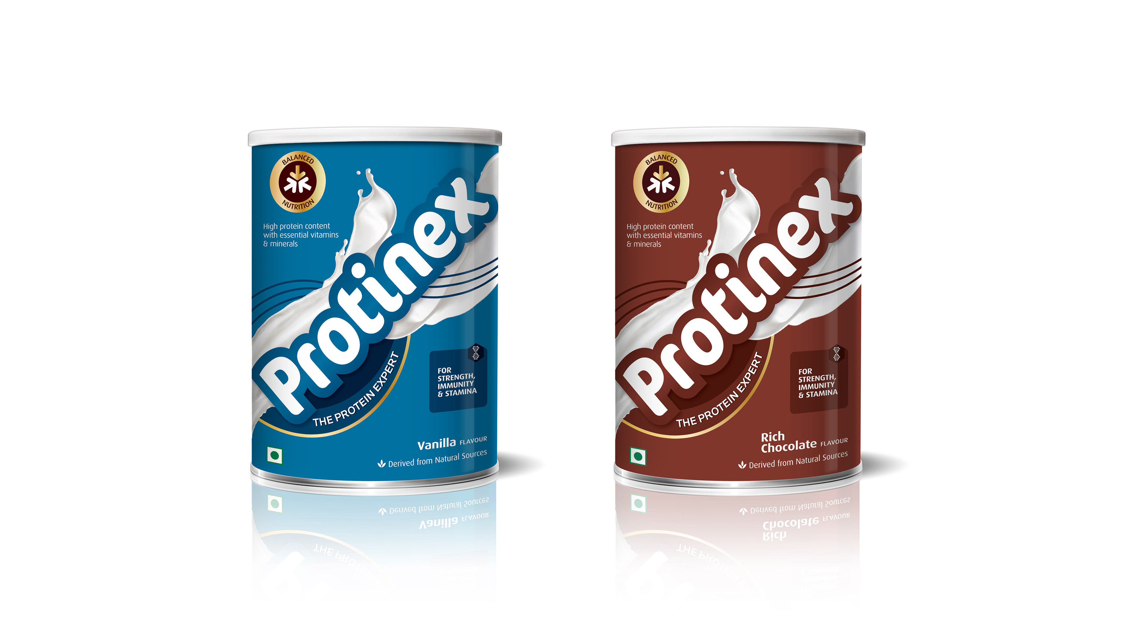
Proposed new packaging for flavour variations – vanilla and chocolate
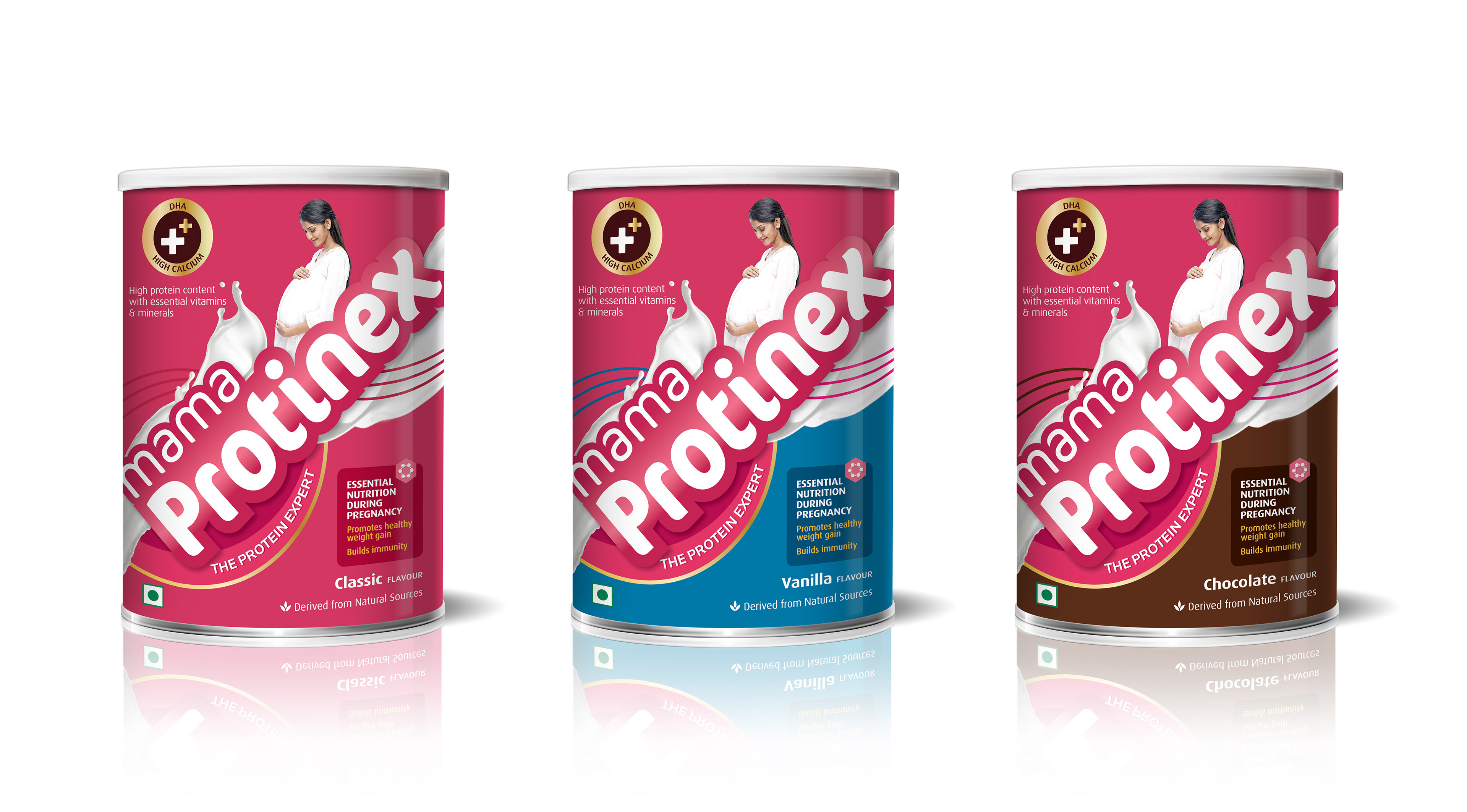
Proposed new packaging for Mama variant in 3 flavours – classic, vanilla and chocolate
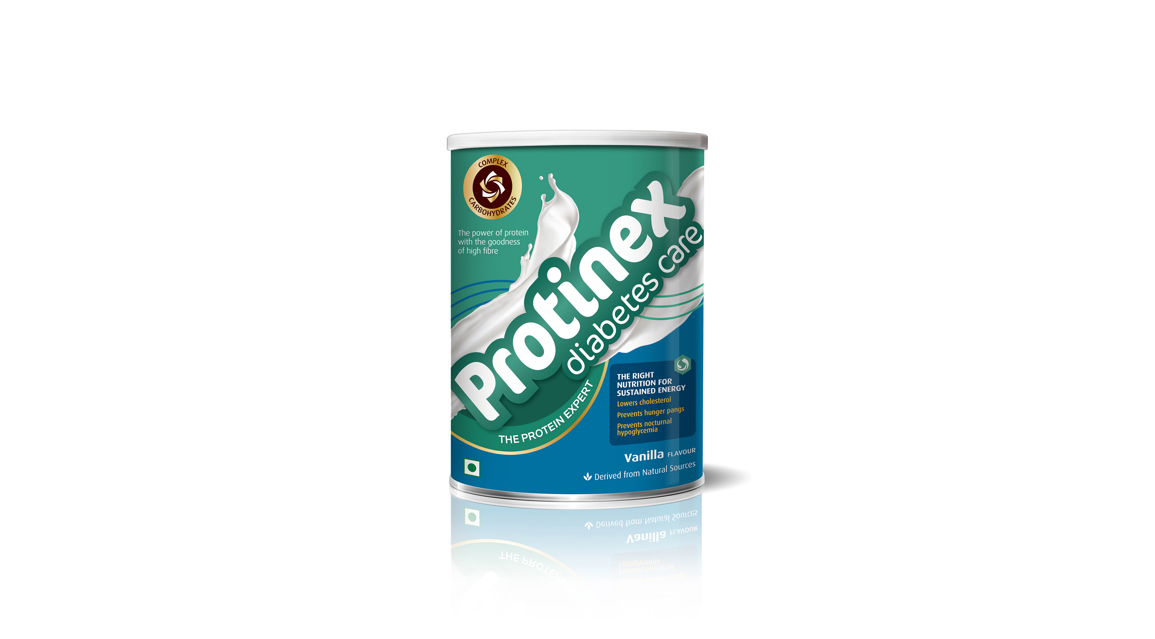
Proposed new packaging for the Diabetes Care variant
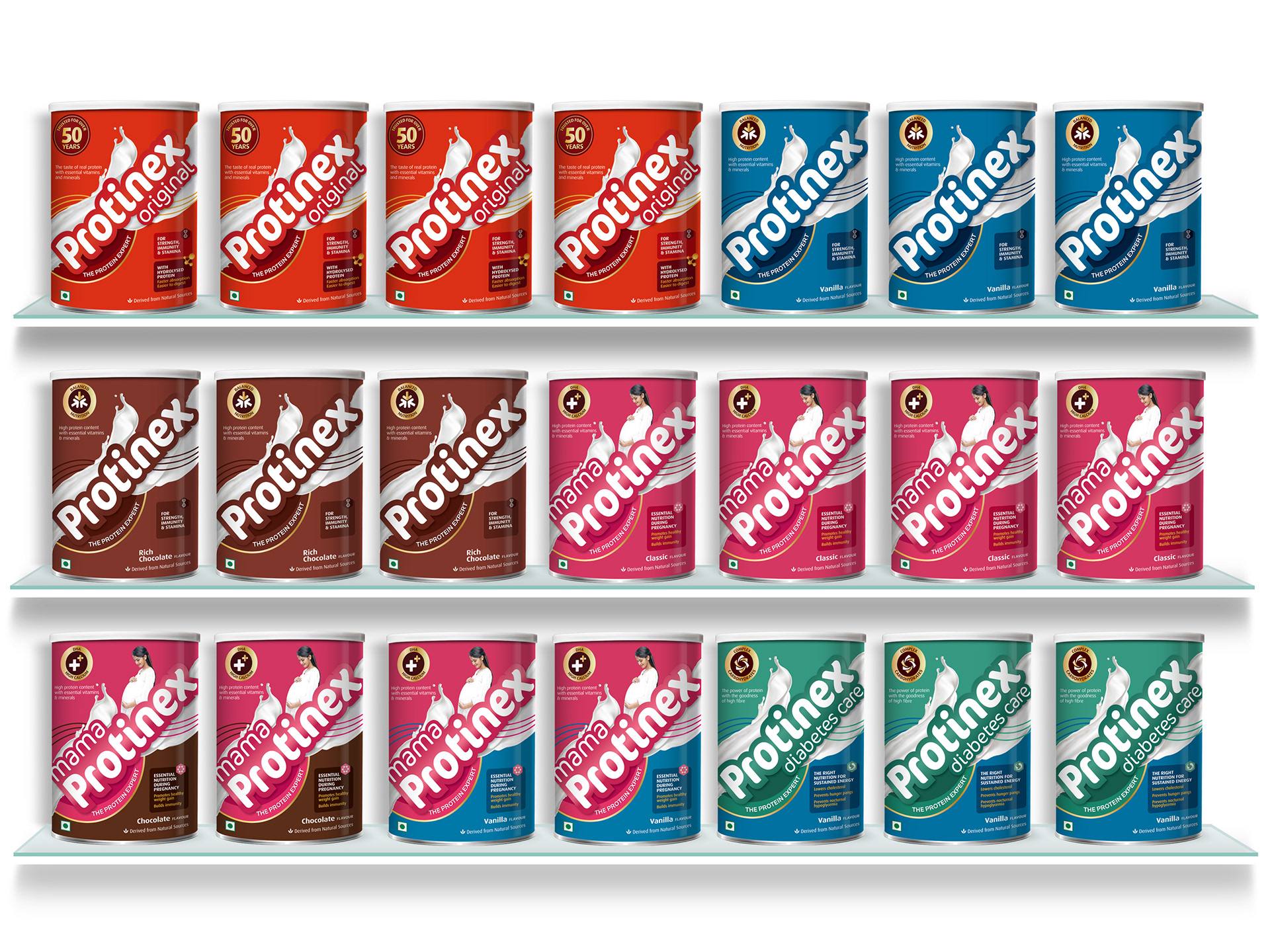
The entire Protinex range in proposed new packaging
*This was a proposed design and not the final packaging.