
A refreshing new look for Wipro's HLS’ annual business reports.
Wipro Limited is a leading global information technology company founded in Bangalore, India. While working at Ray+Keshavan | Superunion, we regularly worked on projects for the Healthcare & Life Sciences (HLS) division of Wipro.
OVERVIEW
The Healthcare & Life Sciences Communiqué publishes relevant news and insights from the healthcare and life sciences world.


EDITION 2
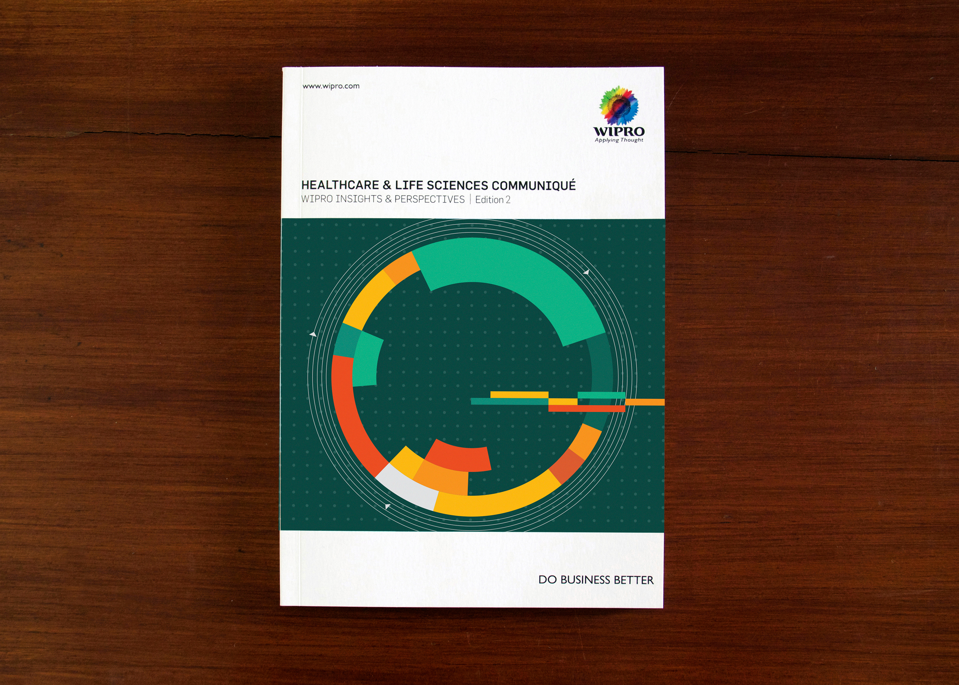
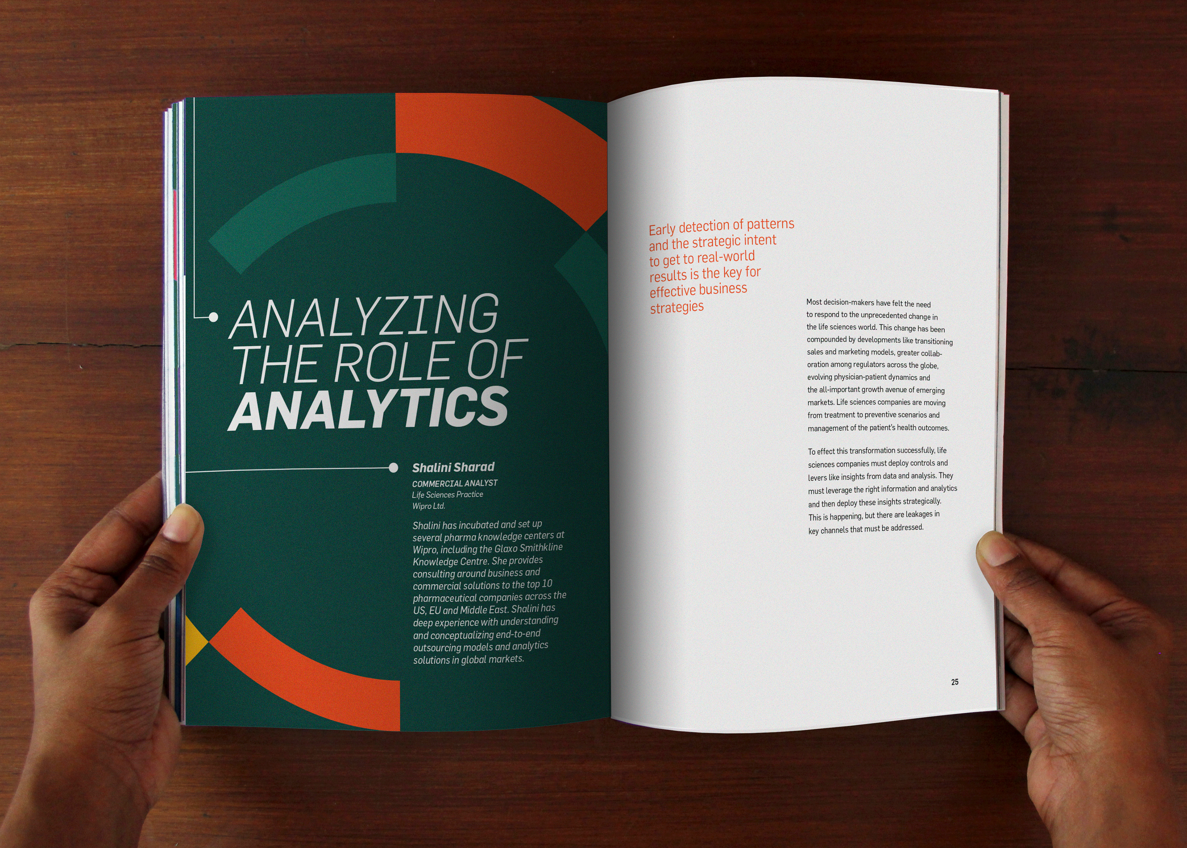
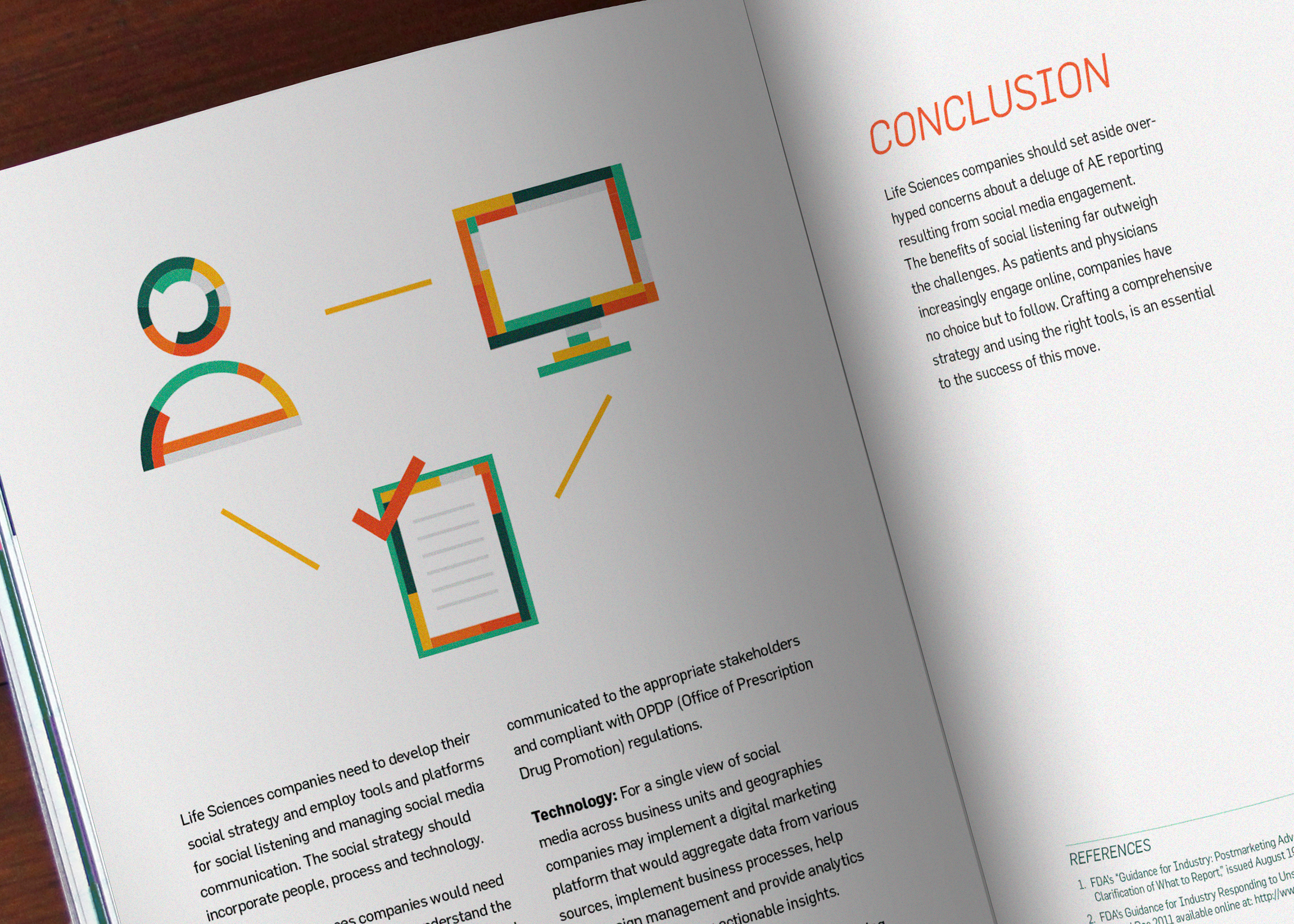
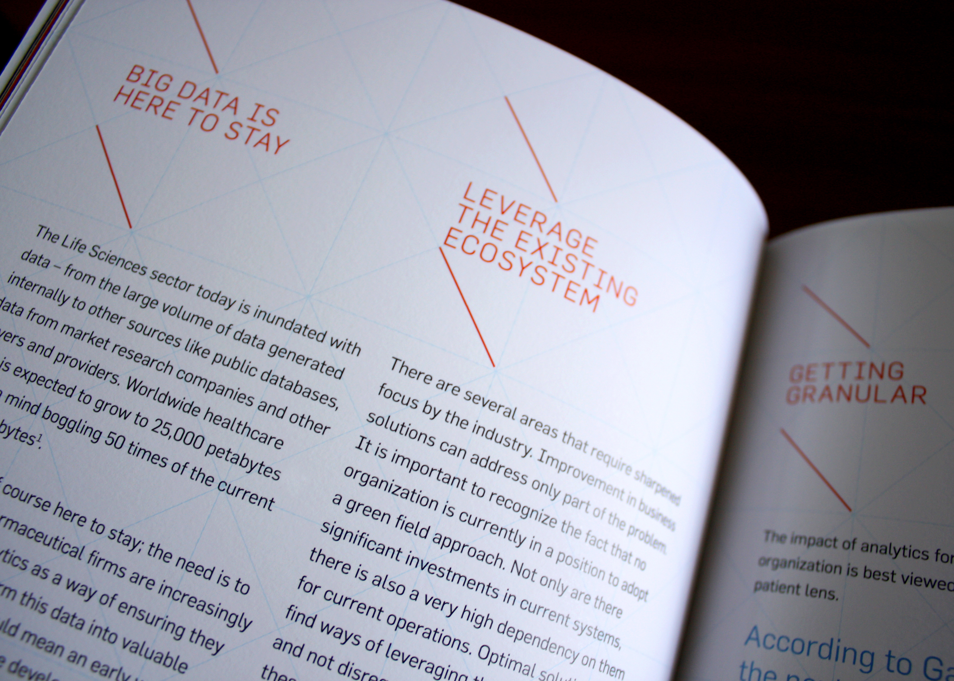
Edition 2 was based on analytics of the global Pharmaceutical and Biotech industries – primarily with the top companies going off-patent causing a continual decline in R&D productivity and decline in sales of products. Visual elements on the cover and across the manual conveyed data – graphs, charts and numbers – that took the form of other recognisable elements such as a bulb or nuts & bolts to accompany relevant text. The colour palette was clinical yet optimistic to highlight the scope for growth. The selection of colours, typefaces and layout worked to make the manual contemporary, interesting and relevant – to cater to a younger, more global audience.
The three main sections dealt with fostering innovation, securing the present and accelerating growth. A similar format to Edition 1 was used yet the visual language was different.
A pdf version of the publication can be found here:
https://www.wipro.com/content/dam/nexus/en/industries/life-sciences/latest-thinking/2464-healthcare-and-life-sciences-communique.pdf
https://www.wipro.com/content/dam/nexus/en/industries/life-sciences/latest-thinking/2464-healthcare-and-life-sciences-communique.pdf
________


EDITION 1
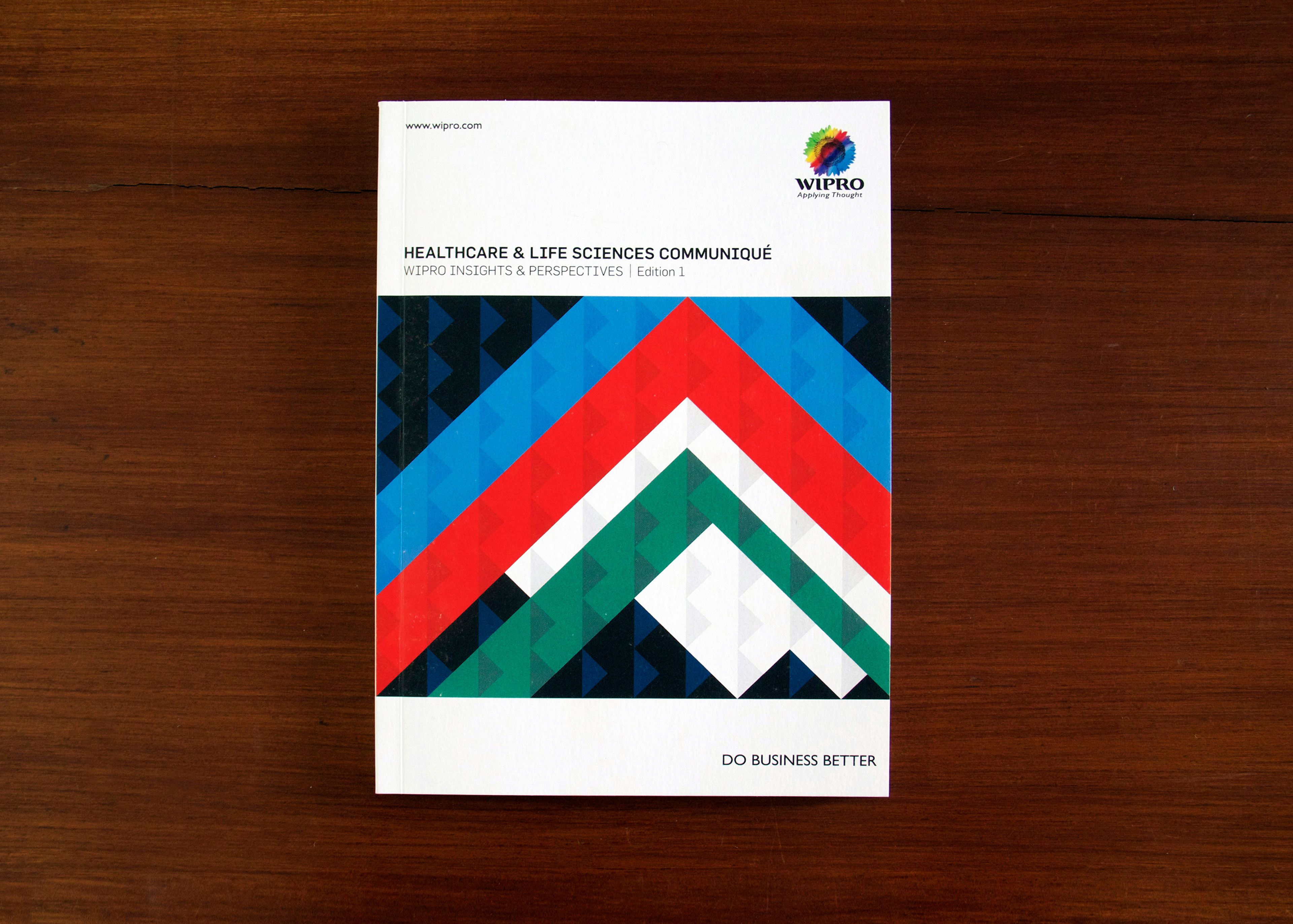
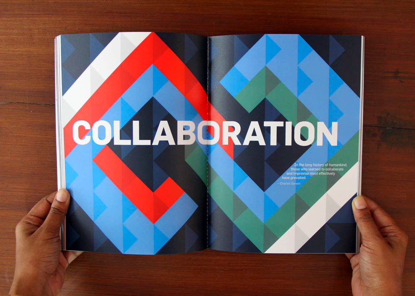
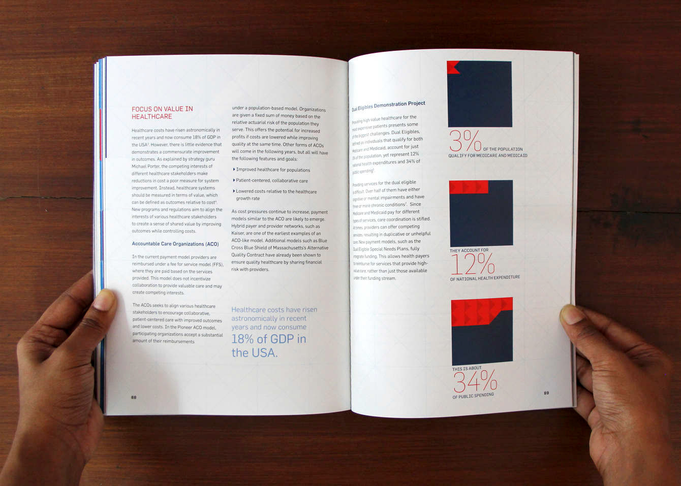
Edition 1 was based on three big trends seen as all-encompassing and all-important – Care, Compliance and Collaboration. The design concept was hence the three-sided triangle with a focus on the future by highlighting all the triangles pointing forwards.
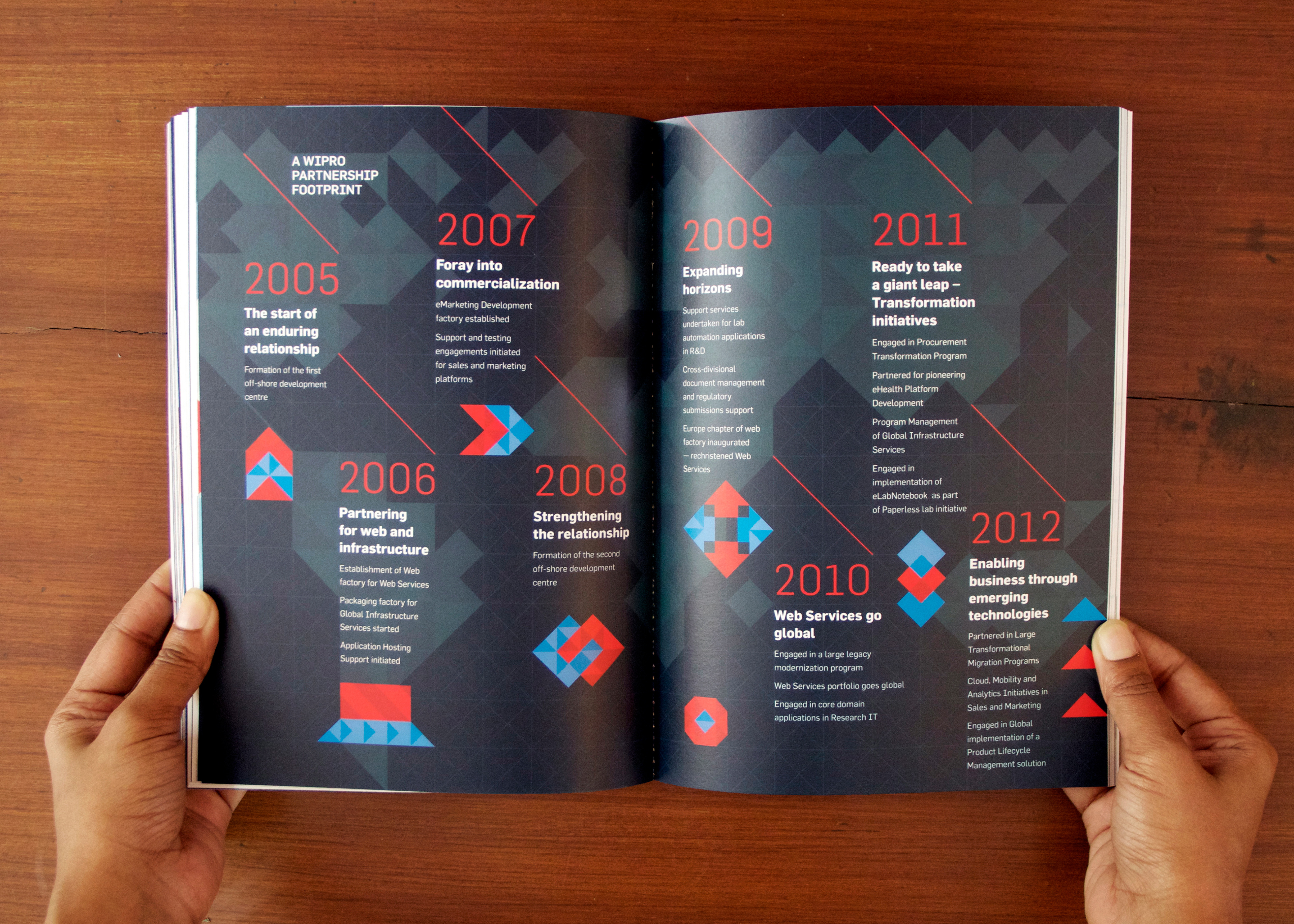
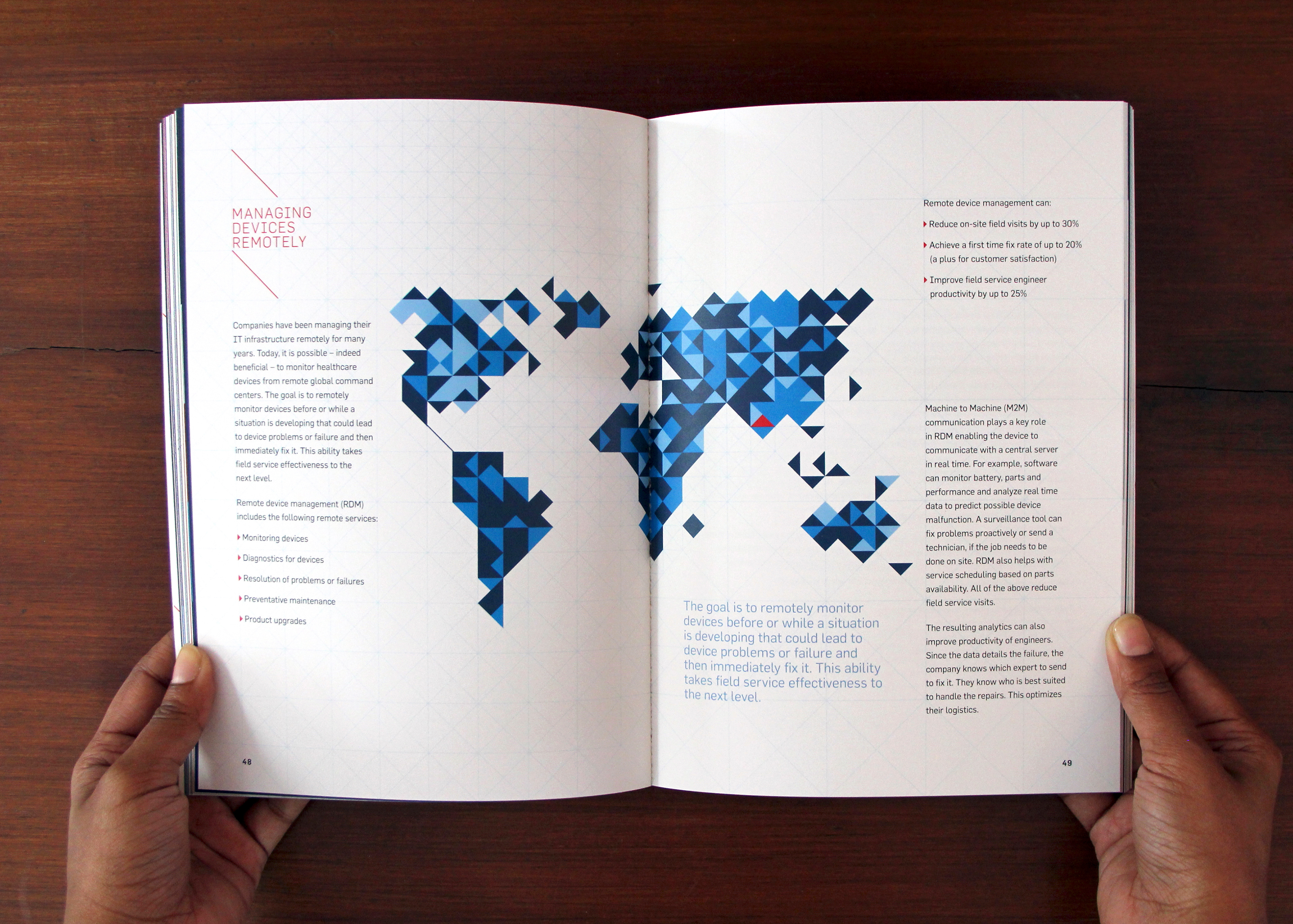
By creating a flexible grid with the triangles, we were able to vary the layouts and provide a sense of dynamism and motion to each page. The cover depicted a mountain rising upwards and the title pages of the three sections – Care, Compliance, Collaboration – were also represented graphically. Charts, iconography and imagery used the same visual treatment to provide a consistent language. Departing from the clichéd illustrations and animated charts used in many business reports, we selected imagery that felt personal and connected to the more emotional aspect of healthcare and life sciences.
The colour palette indicated ambition, growth and vision and was contemporary and relevant to reflect how the HLS division wanted to be portrayed.
A pdf version of the publication can be found here:
https://stage.wipro.com/content/dam/nexus/en/industries/medical-devices/latest-thinking/Healthcare_and_life_sciences_communique.pdf
CO-DESIGNERS: Anoopa John, Sulekha Rajkumar, Mona Solanki