

Branding a vibrant children's festival of Indian classical music and performance.
Presented by Bhoomija, Jackfruit is an annual summer festival of music for and by children with it’s first edition held in 2014.
OVERVIEW
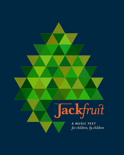
The festival name has it’s origin in the uncommon jackfruit, with thorny outsides that need to be patiently peeled away at the right time to get to the sweet, tender fruit on the inside. What’s more, many Indian classical music instruments are made from the wood of the jackfruit tree.
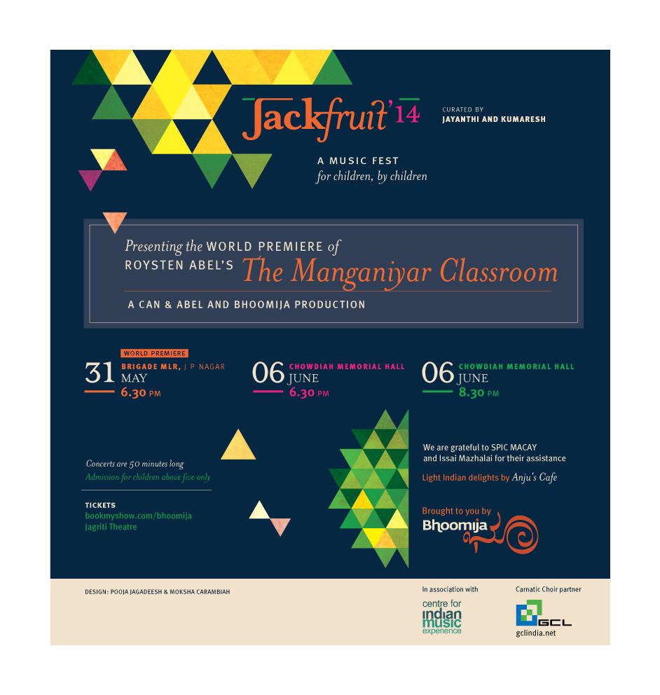
The festival features performances by exceptionally talented children from around India trained by the most eminent names in the Indian classical music scene. Jackfruit ’14 for example, was curated by Jayanthi and Kumaresh, the renowned Veena and Violin duo from Bangalore.
The festival’s highlight in 2014 was the world premiere of the Manganiyar Classroom by the acclaimed Roysten Abel. Other noteworthy performances included Grammy awardee Vidwan Vikku Vinayakram’s taala-vaadya ensemble of children. Besides the performances, there were also workshops with some of the stalwarts of Indian classical music – Fazal Qureshi, Unnikrishnan, Abhishek Raghuram, Ranjani – Gayathri, and Anupama Bhagwat to name a few.
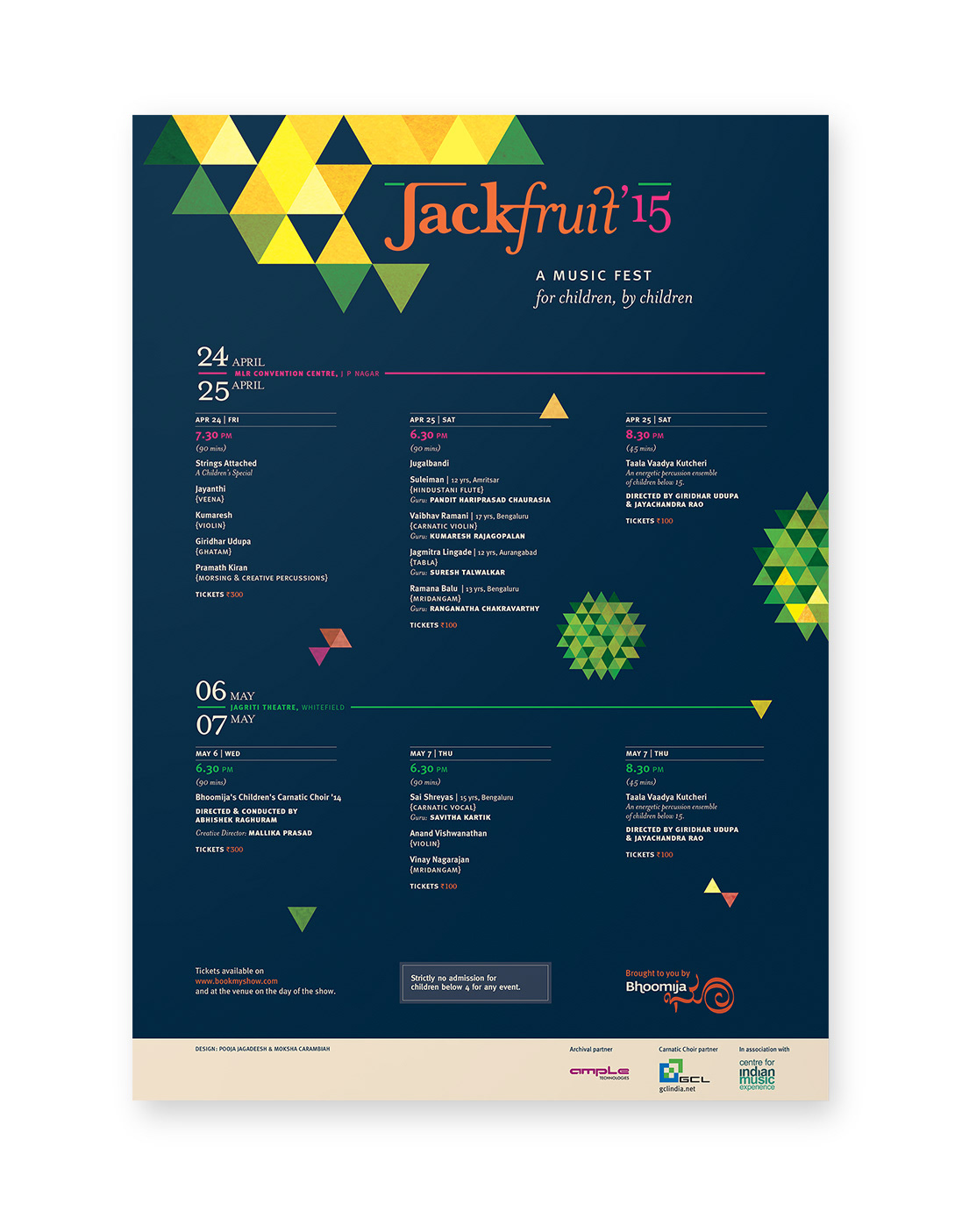
A2 poster for Jackfruit '15
Special Event Emailer

Programme Emailer
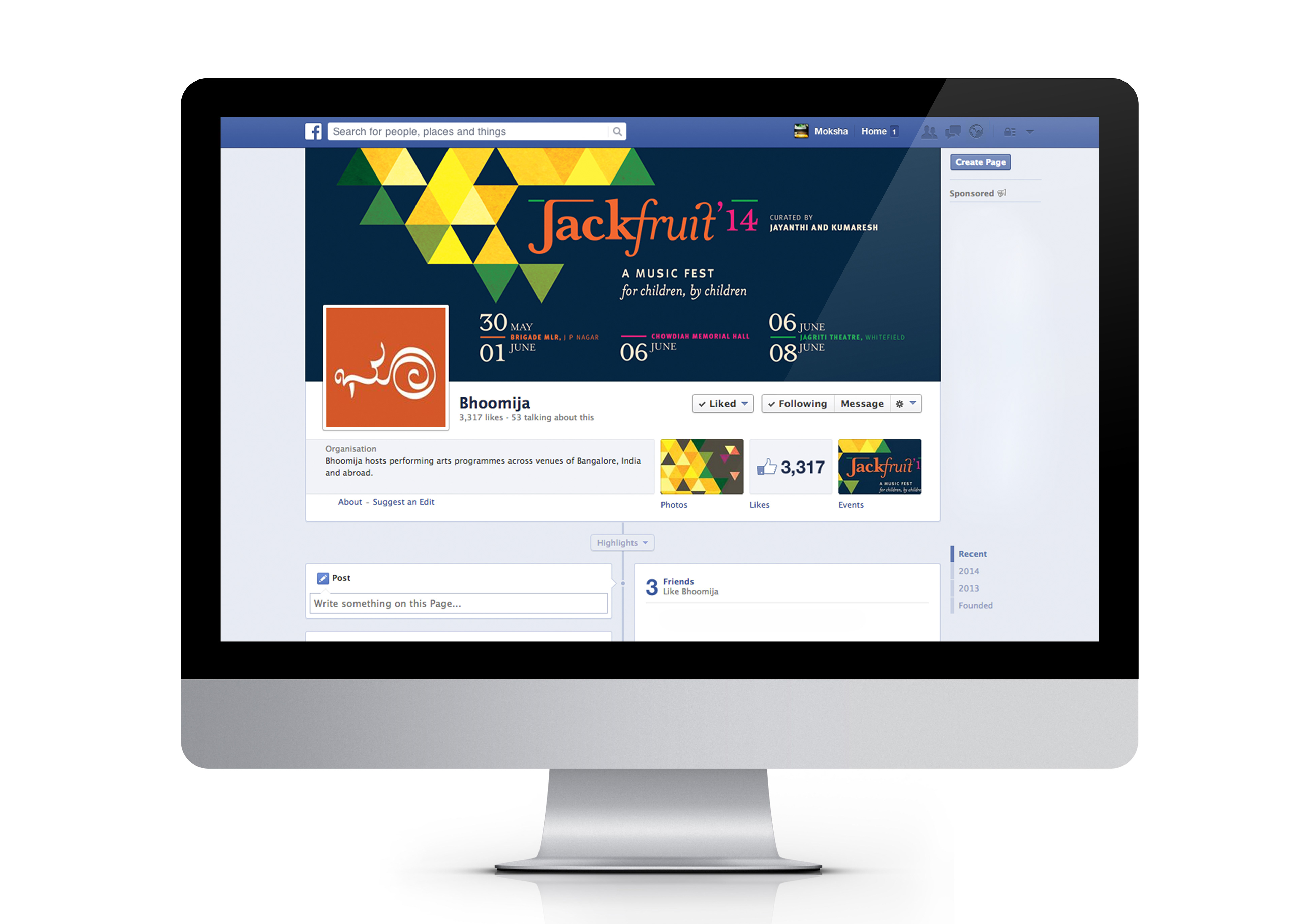
Facebook Page

Bookmark giveaways

Tickets for 2014 and 2015
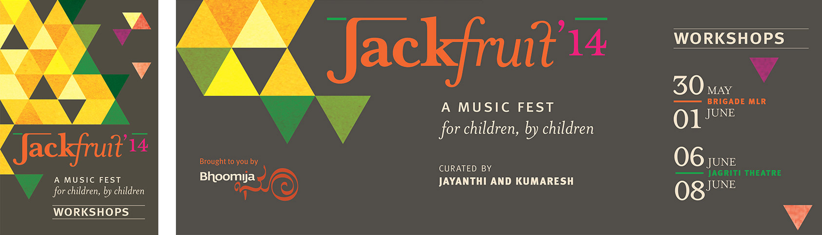
Web banners for festival workshops
Although the event was for and by children, it consisted of some stunning performances that would appeal to a wide range of ages. It was imperative that it didn’t come across as childish (or for children only) as a majority of the target audience would be adults with an appreciation for Indian classical music.
By using a geometric graphic representation of a thorny jackfruit, the form of the fruit translated into playful, colourful, triangles that danced around the poster. The colour palette was primarily yellow and green with a deep blue background reminiscent of a summer’s night under the stars. Pinks and oranges complemented the palette and made it vibrant and joyful. The logotype was a classic serif ending with a playful ligature.
Besides designing the identity, look and feel of the event, design collaterals extended to tickets, bookmarks, participant/faculty badges and wristbands, promotional material – ticketing partner banners, e-fliers, Facebook cover pages and event banners, press releases, venue standees.
The event look and feel was carried forward to 2015 and collateral was redesigned for the new schedule.
CREATIVE DIRECTION: Pooja Jagadeesh